'Beyond Clueless' (2014) -1:42 minutes long
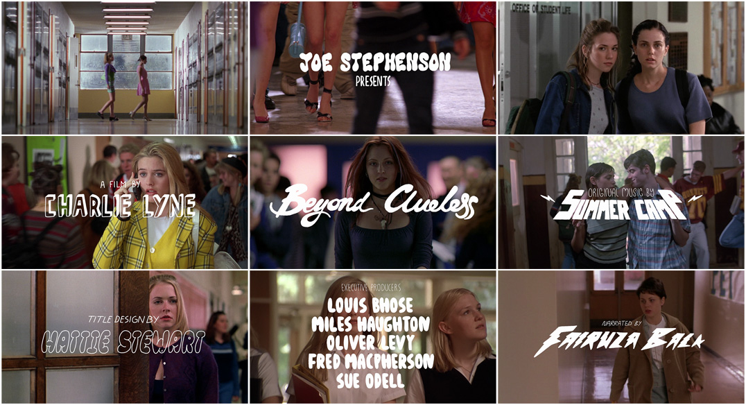 0:10- Joe Stephan Presents
0:21- A Film by Charlie Lyne
0:34- Title
0:41- Original music by 'Summer Camp'
0:48- Title Design
0:55- Co-Producer
1:01- Executive producers
1:19- Producers by
1:28- Narrated by
The length of the credits vary in between different shots, yet at the start it is clear that there is roughly a 10 seconds gap in between each credit given. Through towards the end of the film sequence the gap gets smaller to 7 seconds, which creates a sense of closure of the clip by gradually getting faster.
The fonts used are the same throughout the title sequence. They look quite animated and purposely made to compliment the genre and theme of the film. The sizes vary yet they are all mainly positioned in the centre in a medium to big font.
'21 Jump Street' (2012) -1:49 minutes Long


The length of the credit gap is usually 3-7 seconds in between each credit. The length itself of a singular credit is 3 seconds. In between each credit there is a gap which is used by moving images which reveal the plot.
The fonts used in the title sequence are in italics, bold and have a metallic effect. The font style used looks like ''Agency fb''. The size stays consistent throughout, it is located in the centre and it has effects on it such as; light through each letter to the right and its movement whilst the moving images moves to it at the same time.
No comments:
Post a Comment